Visual Grids
This feature in WireframeApp will help you position design elements exactly where you want them, by aligning to a particular grid or part of the layout.
Do note that, visual grids are not part of your design, and they won't appear on exported documents. They only appear as an visual overlay on your Canvas.
Grids allow you to design with precision, to make sure that you're using consistent sizes and positioning no matter if you're designing for the web, mobile applications, or icons.
WireframeApp has support for two kinds of visual grids: a regulare grid and a layout grid. Depending on the kind of work you need to do in WireframeApp, you may want to use one or the other.
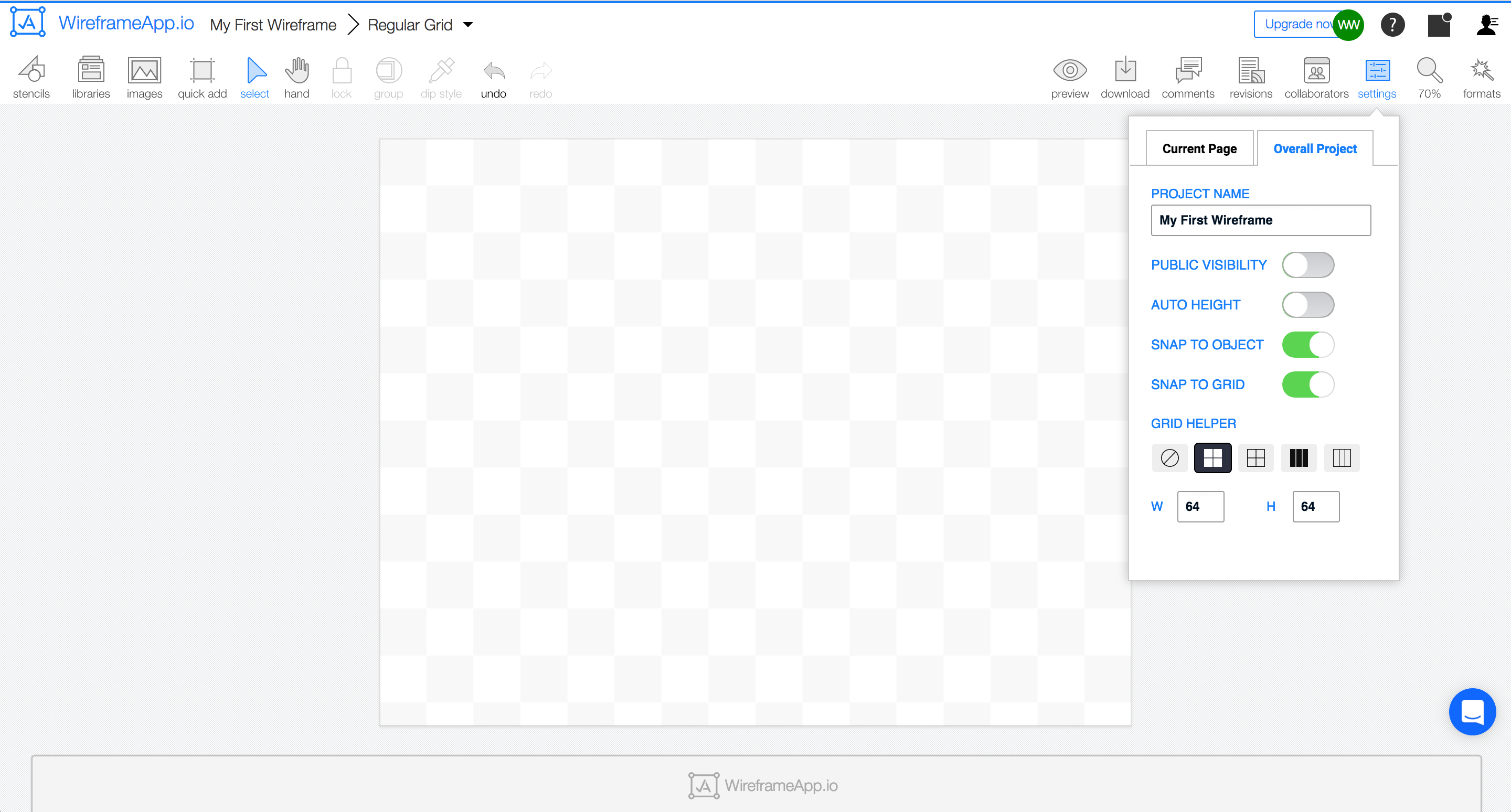
Regular Grid
The regular grid is a typical square grid, that has settings to adjust the size of the blocks, as well as the ability to choose between alternative color grids or plain grid.
Choose Settings → Overall Project → Grid Helper to enable the regular grid.
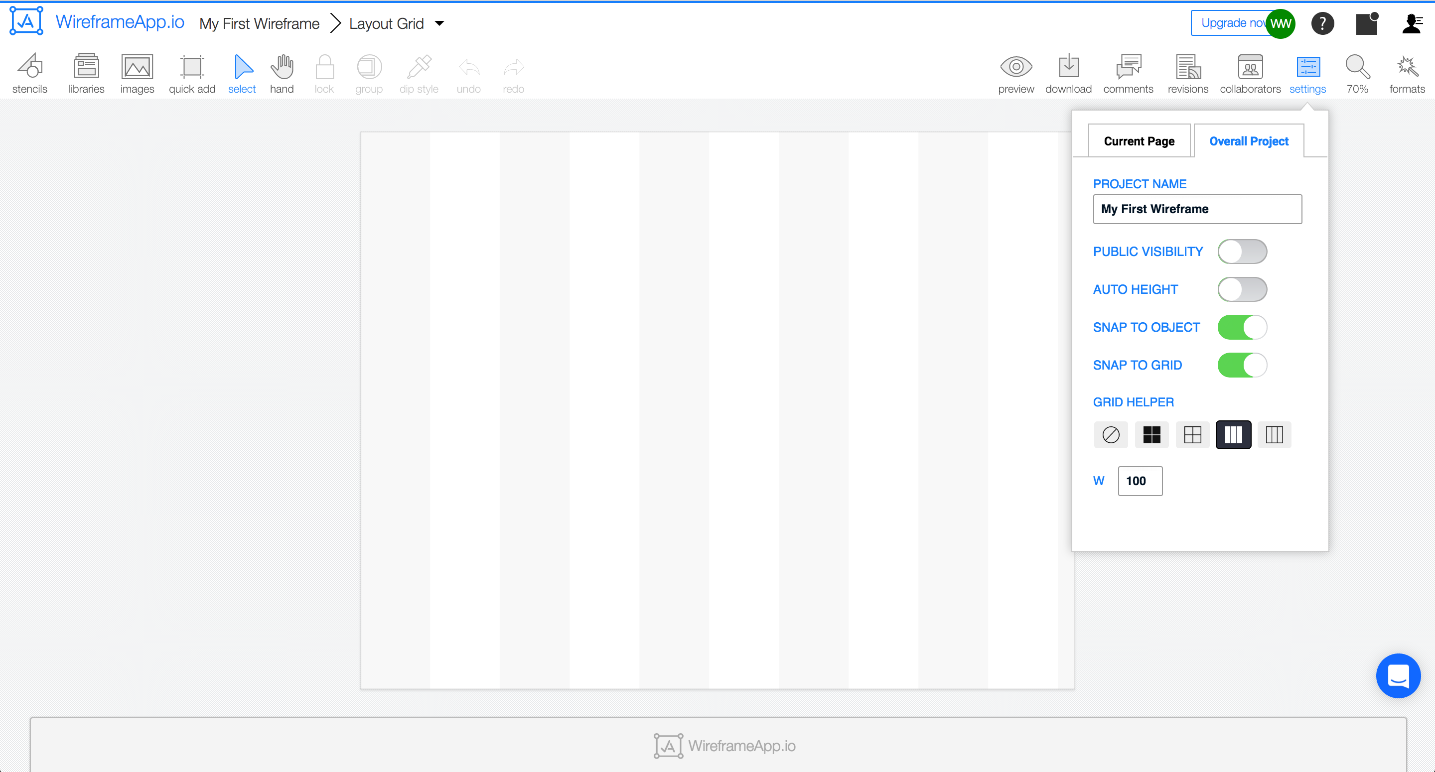
Layout Grid
The layout grid lets you define columns, and is ideal when you’re designing for the web.
With the layout grid, you can display columns with appropriate settings for each. Choose Settings → Overall Project → Grid Helper to display the options.
Note: When grids are enabled, you can choose Snap to Grid option so that any objects will snap to the grid when moved.